Trade Me

In my time at Trade Me, I've worked on the new-look website, the native iOS and Android apps, and contributed to the Tangram Design System. I've also helped mentor and guide other designers, and improve our ways of working as a team.

Tangram Design System

The Tangram design system is for both web and native mobile. I've helped to document and iterate on the web system, and was part of the team who designed and implemented the iOS and Android piece, working closely with developers to realise a beautiful, accessible, and on-brand solution to speed up our execution of high quality work.
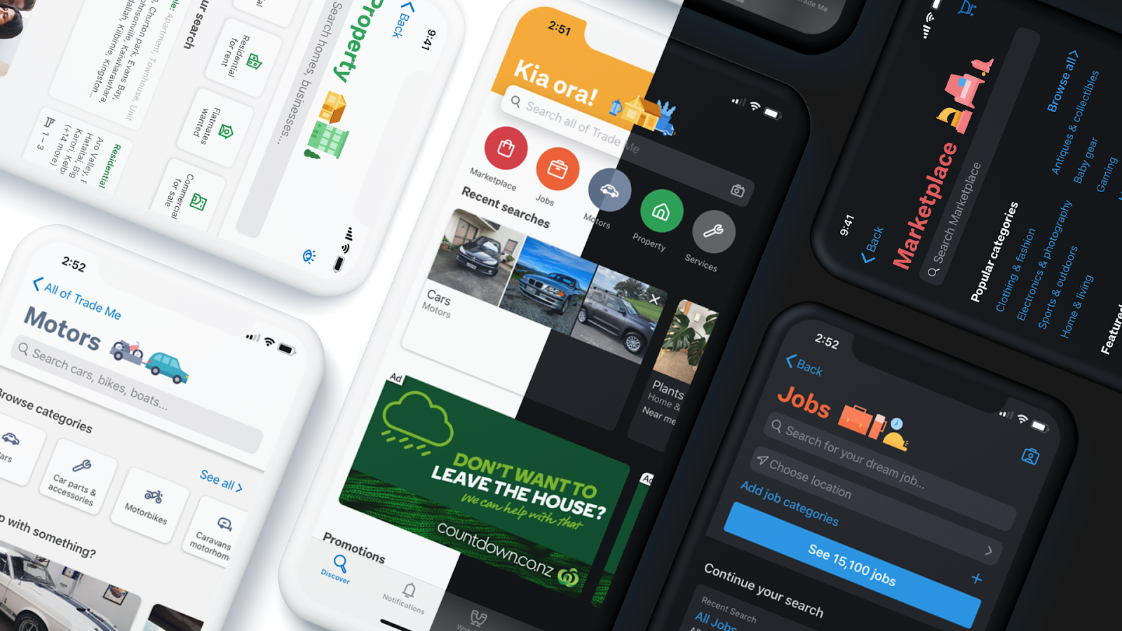
The final new look app home screen and our sub-brand homes, showcasing the flexibility yet coherency achieved with mobile Tangram, and highlighting dark mode, a key deliverable of the project.
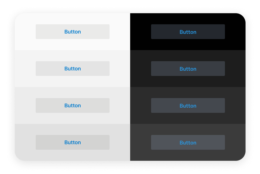
I devised a translucency-based system for our default buttons, allowing them retain distinction, regardless of the ground they were placed on.
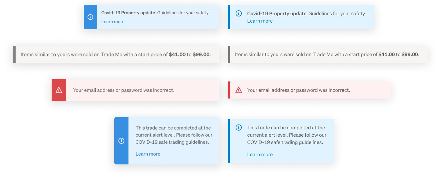
The mobile work informed improvements to the web as well. I used the mobile system to rationalise our web info-box component in style and colour.
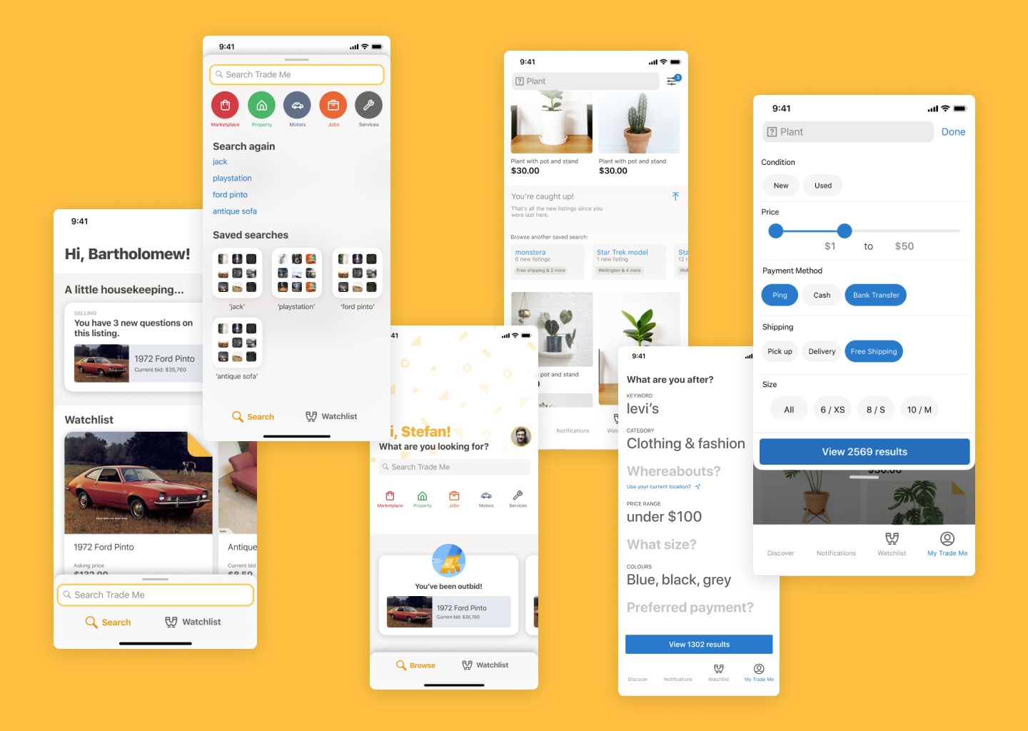
To realise the native mobile system, we completed a set of blue-sky design vision work, to which I contributed.
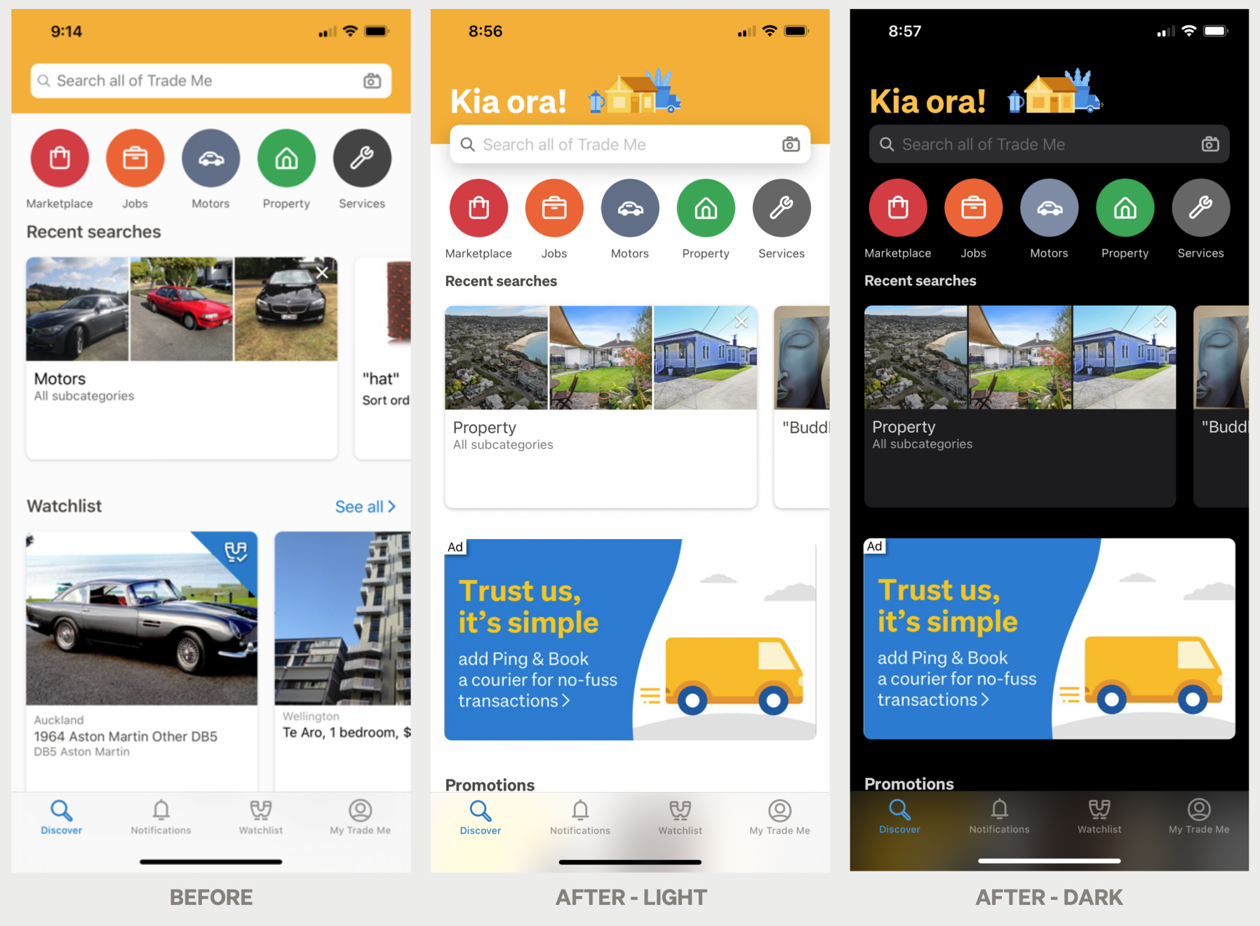
This evolved into the new app Discover page, where we elevated the brand, emphasised the key action, and introduced dark mode support.
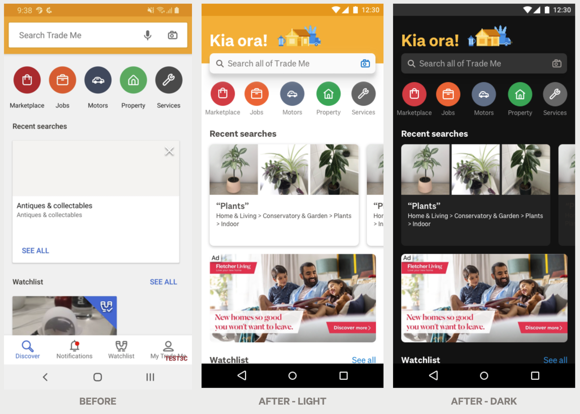
This design was brought to iOS and Android, where it added a higher degree of cross-platform cohesion, while still respecting the considerations and conventions of the OS.
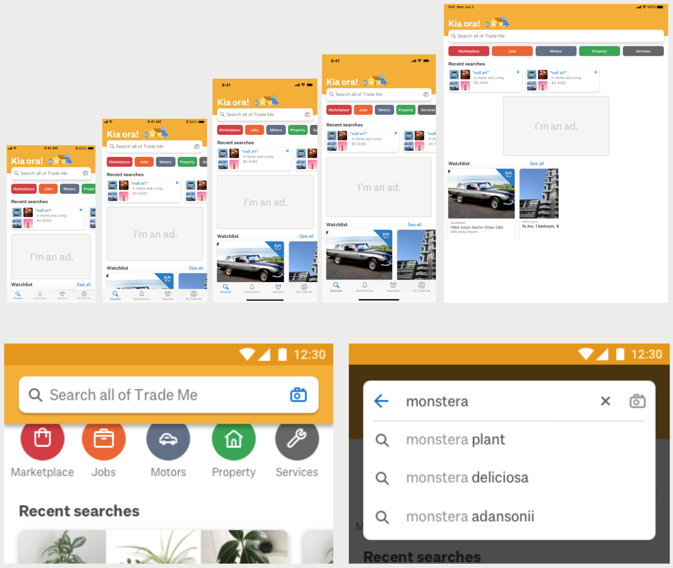
Fine details like the way it resizes for iPad and larger iPhones, and how the search suggestions are handled on Android, were considered at length, including micro-interactions and animation.
Migrating our design team to Figma

After several years, the design team was feeling the pain of our existing Sketch + Abstract based tooling. With the support of the Design Team Lead, I successfully led the migration of our designers, workflows, and system libraries from that platform to Figma, managing library migration and structure, change management and communication, and onboarding and training of the team.

Expand and read more about the Figma move

We started by setting up a working group of product and communications designers from across the business, with a remit to think about the way we work in our practice, and ensure we were in the the best place we could be.

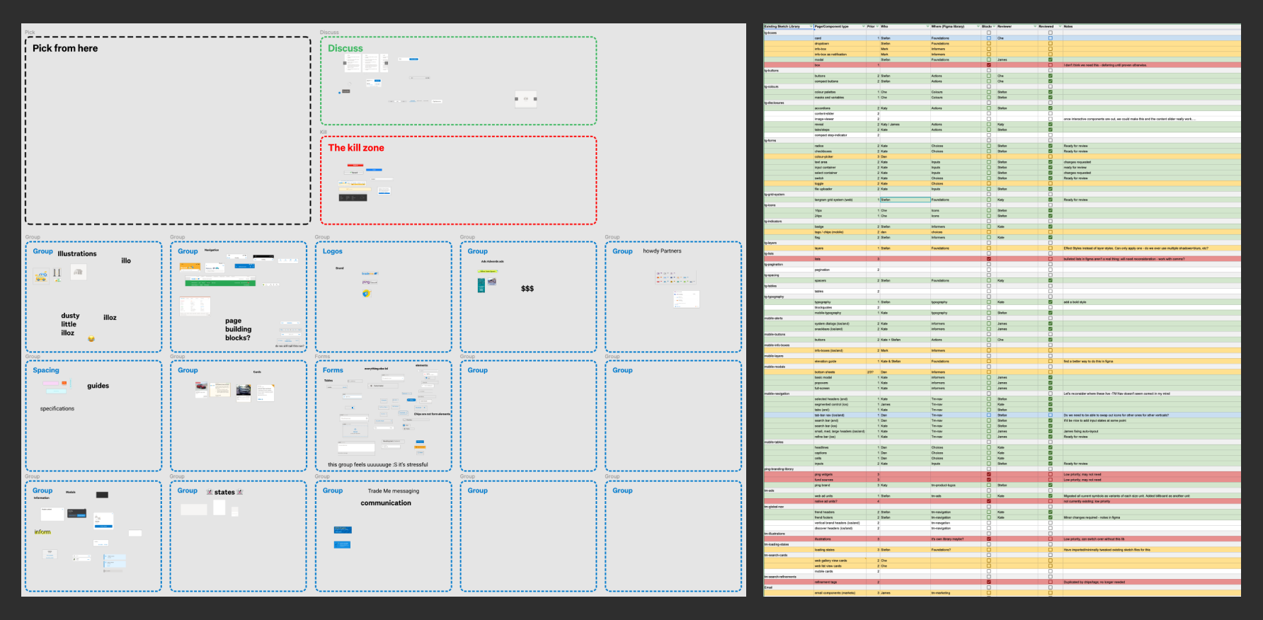
To determine our library structure, I took the working group through a card sorting exercise using all our design system components. Then, I set up a spreadsheet to track the work on moving them all across.

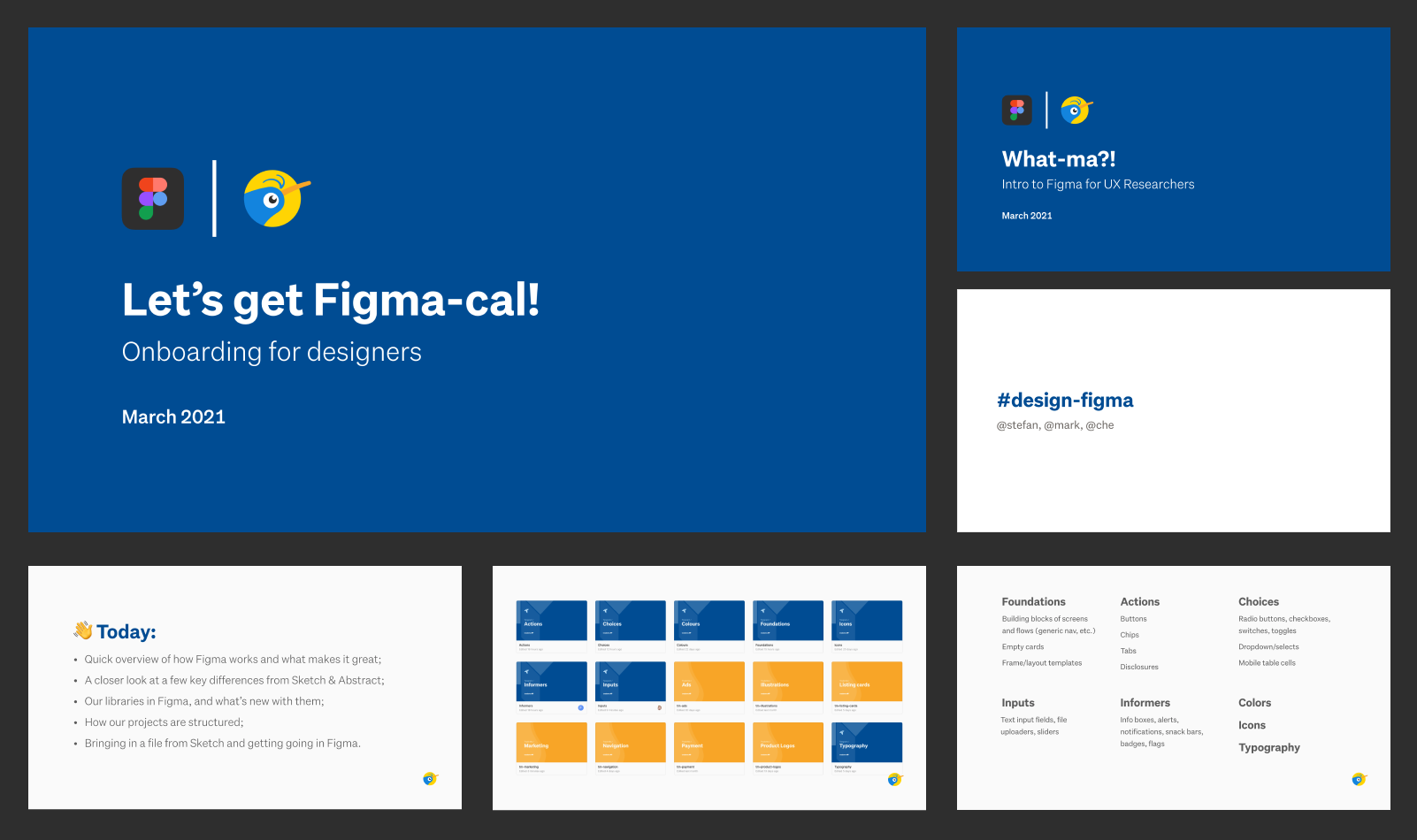
With a structure and a way of working established, and weekly progress check-ins, I set about preparing workshops with all of the designers to intro them to the new way of working, and help them get started. Additionally, I prepared lighter introductions for the people we work closely with: UX research and engineering.

There was a light, approachable attitude to the training and making the switch, and a focus on the improvements to the libraries.

The real joy creating a blank file in Figma, and inviting everyone to jump in and edit all at once, giving a roomful of designers the freedom to go completely wild and live out their collaborative graphic design fantasies.

The final output of our Wellington training workshop.

Ultimately, the transition has been a fantastic success, with all designers now comfortably working fully in Figma, and zero concerns or comments when we cancelled the Sketch licenses.


Selling on Trade Me

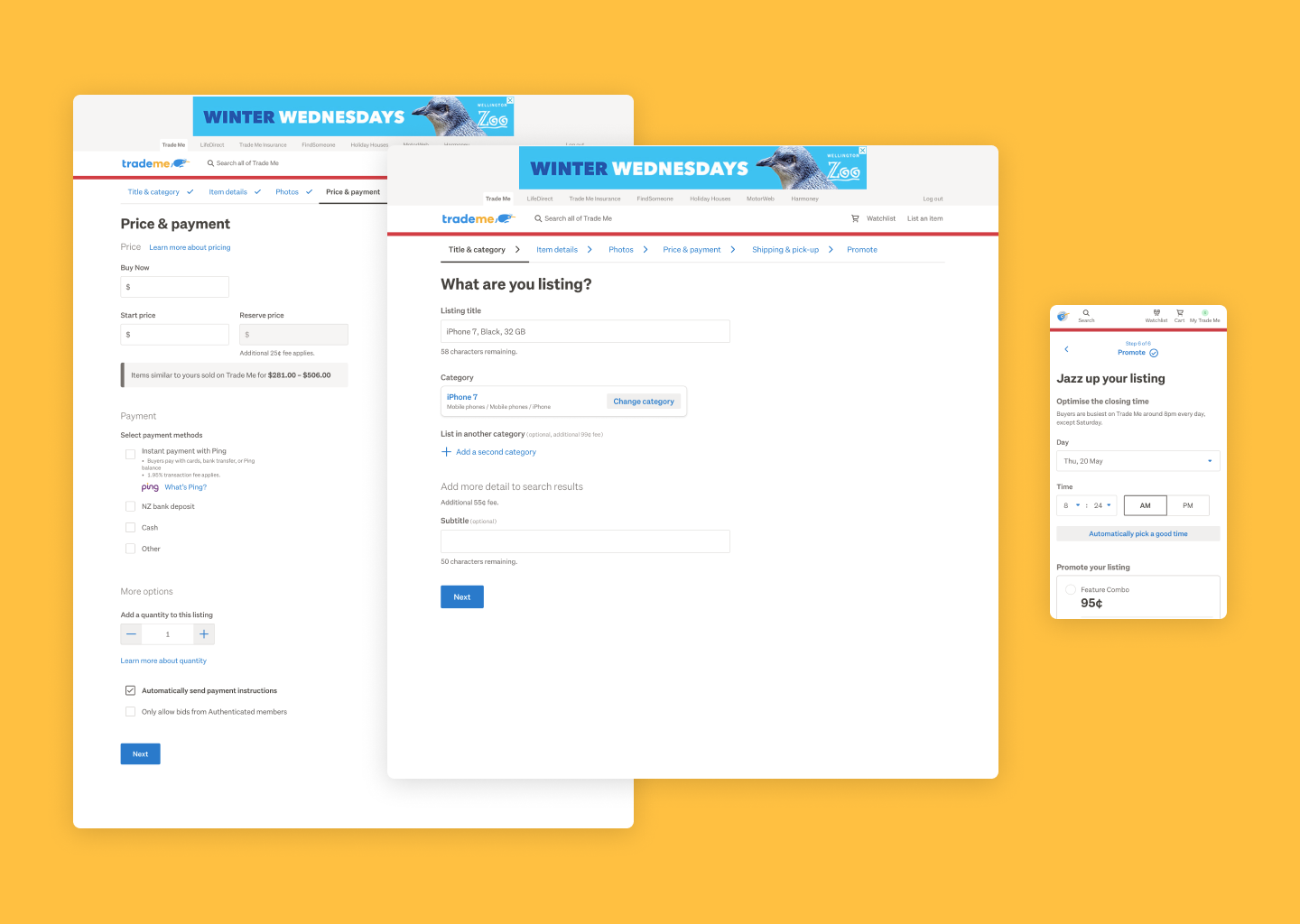
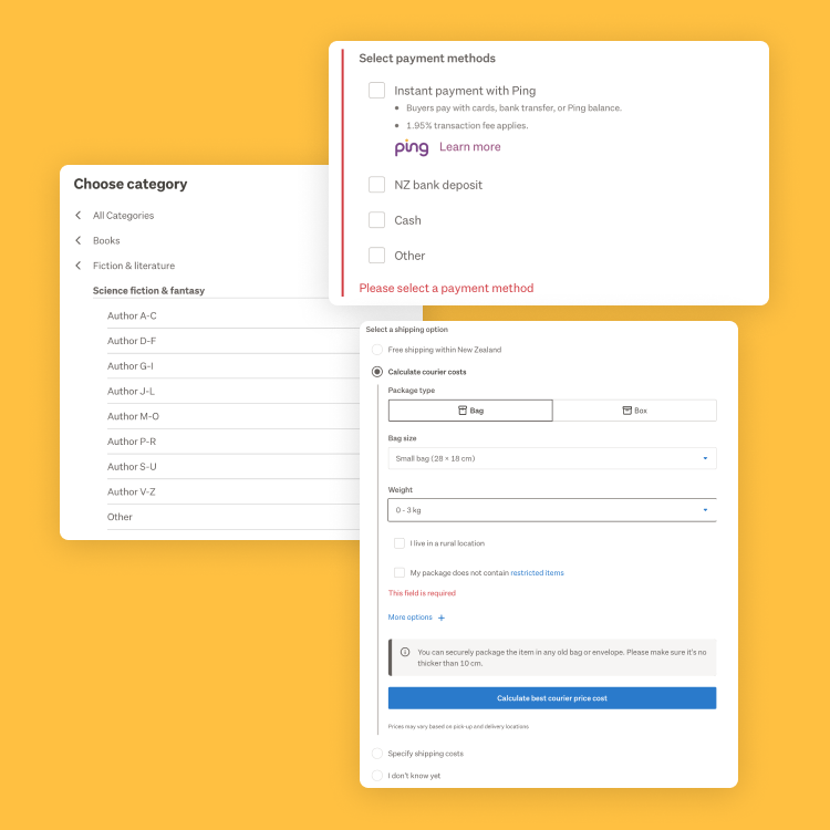
A large piece of my day-to-day work at Trade Me has been improving the experience for our users selling general items, including a new-look, responsive sell process.

I redesigned the web sell process for the new-look, responsive Trade Me site, seeing an improvement in key revenue metrics and ~87% customer satisfaction.

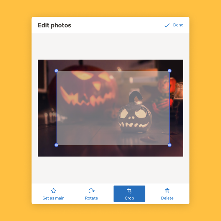
New features based on customer requests were included, such as a simple cropping and rotation tool for image editing.

The process simplifies a lot of complexity, deferring it to logical places for experienced users while not overwhelming newcomers. There are less clicks and less cognitive overhead to getting a listing live.

Other workshops

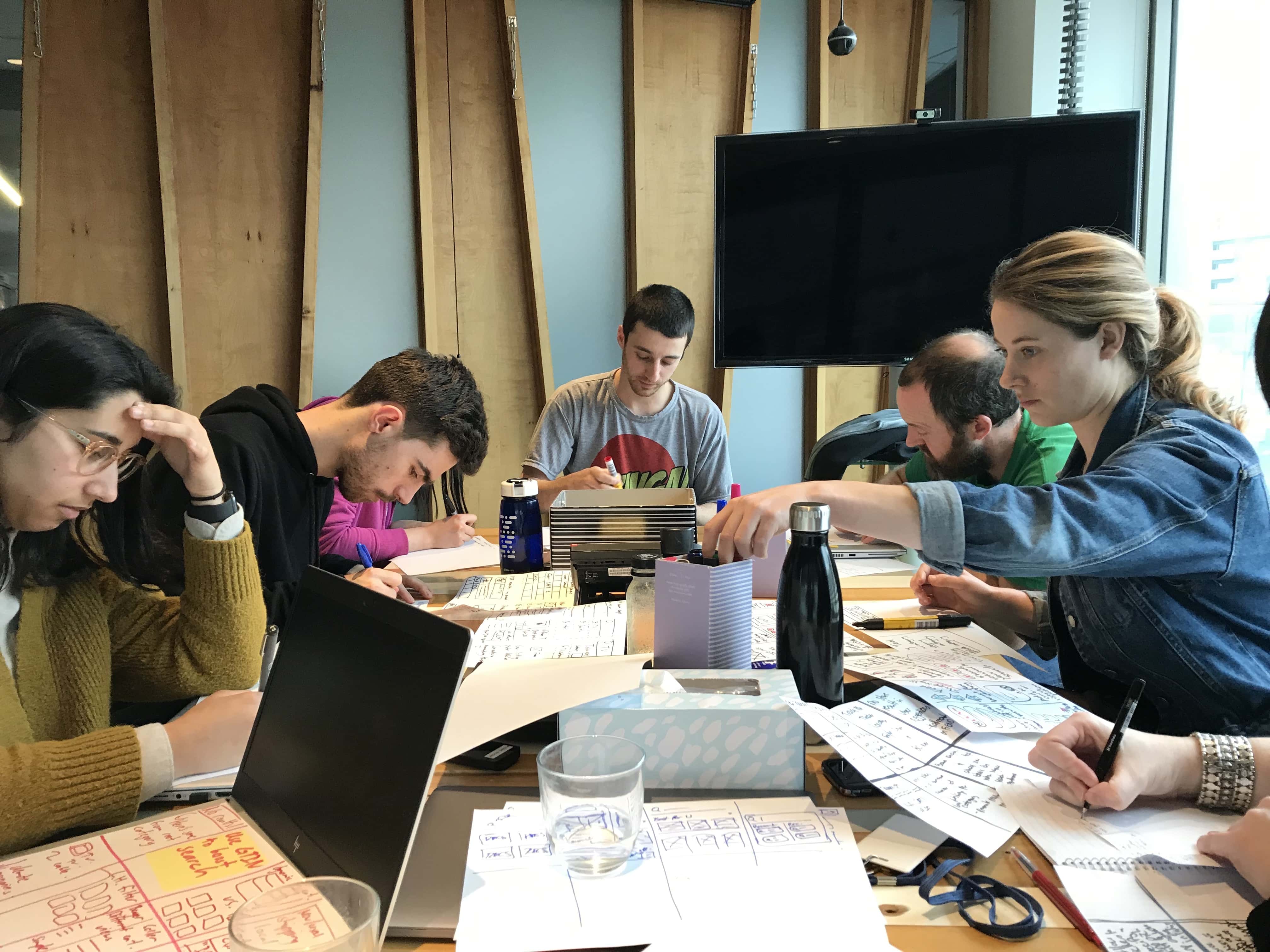
I've organised and led a number of cross-discipline co-design and ideation sessions and upskilling workshops, helping bring wider teams into projects, and teach designers skills in web front end development.

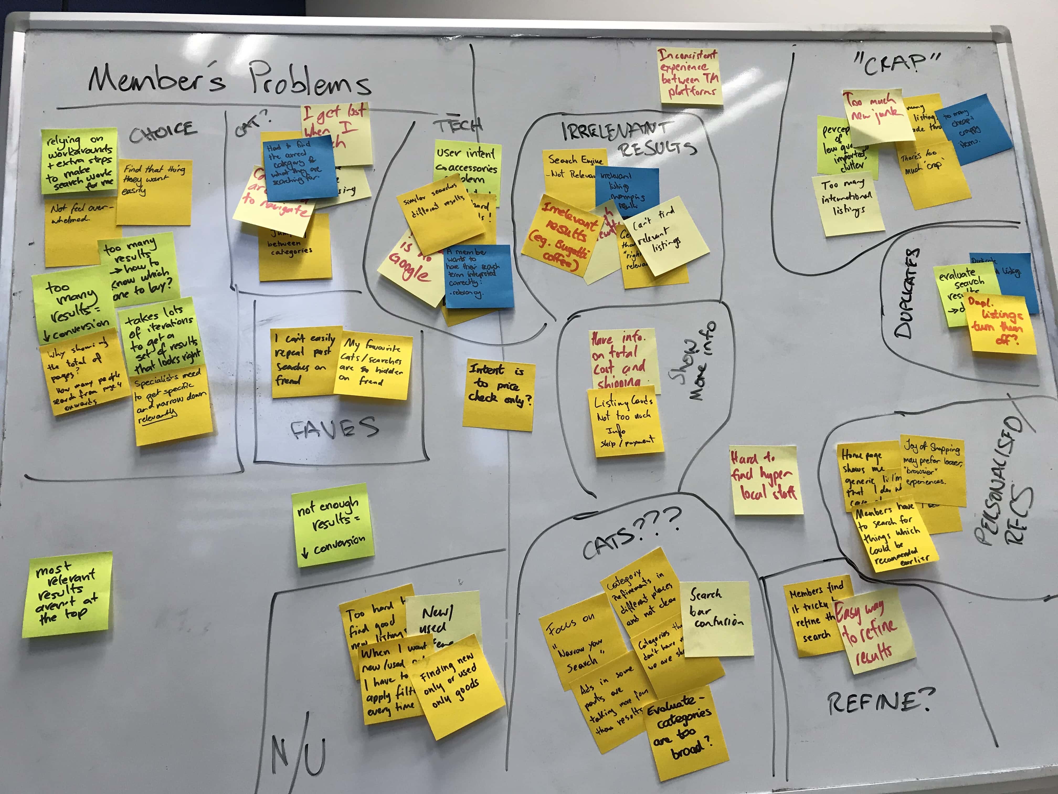
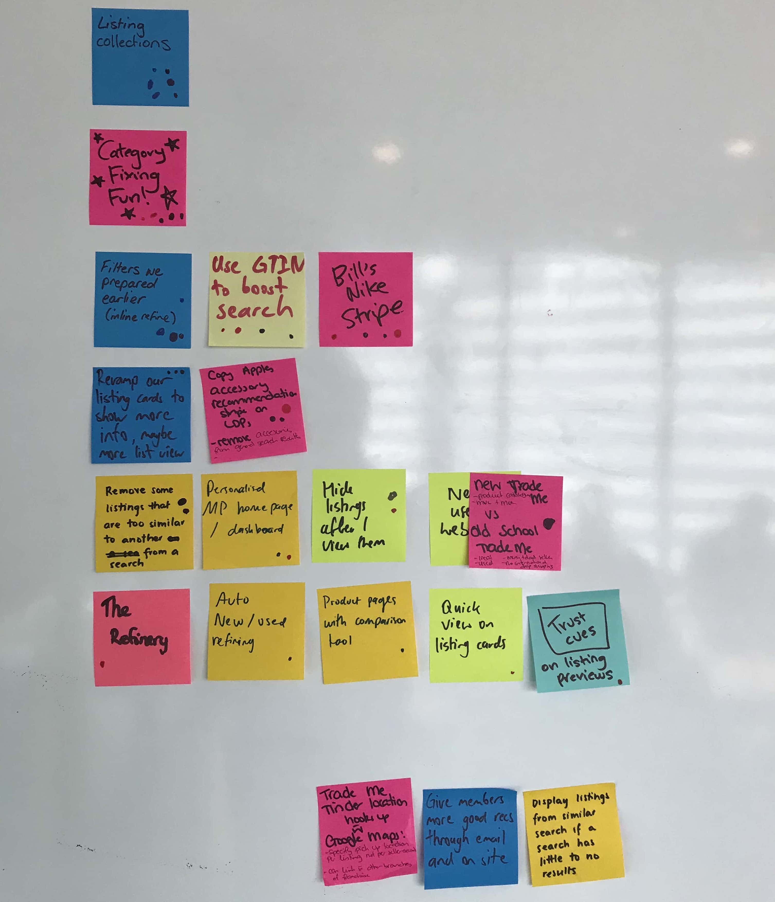
I've led several cross-disciplinary ideation and co-design workshops, bringing product, engineering, design and commericial into one room to collaborate.

Using each discipline's existing knowledge, research, and insight helps draw out the key customer problems, providing a space to ideate within.

Ultimately, everybody has the room to contribute ideas they might not otherwise have felt comfortable sharing, and we work together to explore them in more detail.